Guidelines for Human-AI Interaction

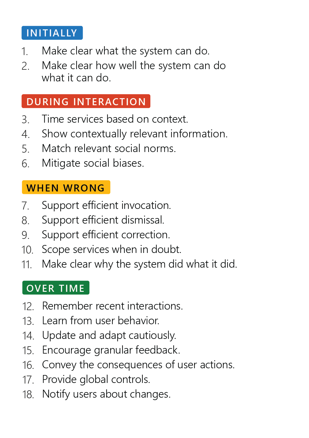
I had the pleasure to work with colleagues from Microsoft on a CHI 2019 paper, Guidelines for Human-AI Interaction. This post provides links to the paper, related resources, and blog posts:

  • Publication page on Microsoft Research (MSR) – contains the paper and printable cards, poster, and presentation
  • MSR blog post about the work
  • Medium post explaining the guidelines
  • … check back for more!

Featured project: DIA 2

Problem: The National Science Foundation (NSF) needed a way to help them understand and evaluate their funding portfolio.

Context: NSF is a federal agency that provides, on a peer-reviewed, competitive basis, funding for research, in order to advance the mission of science.

My role: I was a co-Principal Investigator on this $3 million, 4-year project. I lead the UX research and design.

Project goals: 

  1. Create a tool for monitoring and evaluating the NSF funding portfolio that would serve NSF’s internal and external users.
  2. Advance the mission of science by generating fundamental knowledge and research publications in the area of portfolio management.

Phase 1: NSF employees

In the first phase of the project, we focused on serving the internal NSF audience. My contribution to the project was as follows:

I planned & conducted formative research in the field in order to identify user groups inside the NSF and understand their needs. I focused the data collection around questions such as:

  • What are decisions made by NSF employees on a regular basis?
  • What information do they need to make those decisions? Where is that information located, in what formats, and how do they access that information?
  • What are the larger goals of NSF employees? What makes them feel successful? What are their big motivators?
  • I closely supervised a graduate research assistant who assembled the user modeling report containing 3 personas. We published a paper in the Proceedings of HCI International that presents the results to an academic audience.

I chose the most vulnerable persona as the primary one. I lead the interdisciplinary research team through a design exercise where we created a context scenario for our primary persona and extracted design requirements – what information would Matt need in order to begin understanding his funding portfolio and be productive at his new job? I generated early sketches based on our brainstorming. The general approach we took to knowledge mining and visualization is explained here and here.

I directed students as they started working on wireframes based on my sketches and coordinated the communication between the UX and technical teams. In the days before Slack, I used an internal team blog to track and communicate work.

I conducted early testing on the alpha version. My goal was to assess ease of learning. Could our users figure out how to use our Web application? Would they understand the interactive data visualizations and interpret them correctly? User feedback, documented in this report, included comments such as:

I feel this was designed for me!

and

This thing reads my mind!

We delivered DIA2 to the NSF and proceeded to focus on the external audience:

Phase 2: NSF external audience

The team identified STEM faculty members as the largest external audience. These are researchers who need to understand the funding portfolio in order to better target their proposals to the NSF.

I designed an interview protocol for intercept interviews we conducted at the annual meeting of the Association for Engineering Education, where we were most likely to encounter STEM researchers from various fields. I trained a number of graduate students and we all conducted interviews and collected the data we needed in 3 days.

I lead a cross-disciplinary team of graduate students from both the UX and technical teams through a 2-day affinity diagramming process, which resulted in one persona, documented in this report and this conference paper.

With an understanding of the second user group’s needs, I wanted to ensure DIA2 served them well. I lead the team through cognitive walkthrough exercises where we asked whether Dr. Anderson, our persona, would know what to do, and if he performed an action, whether he would know he was making progress towards his goals. I supervised one of my graduate students as she conducted usability testing with this new user group. This work resulted in a conference paper and her M.S. thesis.

DIA2 served about 2 million visitors in a 2 year period. About 2,000 users had created accounts. The project is over and the data is no longer updated, as is common with a lot of academic projects.

The research & design process, as well as technical aspects of DIA2 are presented in a paper we published in IEEE Transactions on Visualization and Computer Graphics. More research related to DIA2 is indexed on the project’s research page.
ASEE 2015: Paper about the new HCDD major

It feels like I just returned from the annual ASEE meeting. I presented a paper about a topic near and dear to my heart: the new undergraduate major in Human-Centered Design and Development (HCDD) I spearheaded at Purdue.

The paper tells the design story (birth story) of the new program. I took a user-centered approach to curriculum design, since that’s what I know best. I think one of the most valuable tools that came out of it was the vision persona. And, of course, the program itself. 🙂

The paper is available online (you can read it here) and the slides I used are below.

DIA2 is out of beta!

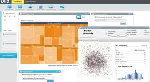
Screenshot of DIA2 showing multiple toolsI am so pleased that we launched the redesign of  DIA2 and the new homepage this weekend! It’s been a long and fun journey!

DIA2 is a Web application for knowledge mining and visualization of the NSF funding portfolio. Anyone can use it to explore where NSF funding goes, how it’s distributed geographically, across NSF divisions, across topics, and institutions. You can explore collaboration networks of researchers who worked together on proposals, identify who’s well connected in a field, and figure out what NSF programs and program managers have funded research similar to yours.

I’m happy to have been involved with DIA2 since the very beginning, as a co-Principal Investigator (co-PI). I led the UX team for the project. We started with user research to understand user needs, and moved through ideation, wireframing, testing, the whole 9 yards. It’s been very rewarding to hear users say, “This thing reads my mind!” and “I feel it was designed for ME!” Perhaps best of all, DIA2 gave me the opportunity to work with and mentor many talented students. All DIA2 “employees” have been students working under a PI’s supervision. I am so proud of them!

If you’d like to, go check DIA2 out for yourself – it’s available for all at DIA2.org.

Or, read some research papers about it:

Using visualization to derive insights from funding portfolios. In IEEE Computer Graphics and Applications, 2015.

DIA2: Web-based cyberinfrastructure for visual analysis of funding portfolios. In IEEE Transactions on Visualization and Computer Graphics, 2014.

Portfolio mining. In IEEE Computer, 2012.

Which self?

I recently watched this TED talk by Daniel Kahneman about the experiencing self and the remembering self.

Apparently, they’re quite different. The experiencing self is the one who lives and feels in the moment. The remembering self is the one that engages in retrospective sense-making and decides, post-facto, whether the experience was good, fun, etc. It is the remembering self’s evaluation that informs future decision making.

This has enormous implications for UX evaluation. Even if the experiencing self has a (relatively) bad time, as Kahneman explains in the talk, but the remembering self makes a positive evaluation, the experience is remembered as good. We can measure UX in the moment, and track eye gaze and all that jazz. But ultimately, what really matters for future decisions is what users take away from the experience and how they evaluate it after it’s over. This is good news. It means that users may forget or put up with a few frustrations – and still assess the experience well, especially if it ends well. It also means that the research framework for website experience analysis that I created back in 2004 is valuable, because it focuses on how users make sense of the experience and what they take away.

Undergraduate UX-related courses

I get this question a lot from undergraduate students interested in pursuing careers in user experience (UX):

If I want to pursue a career in UX, what kinds of courses should I take to prepare?

In addition to courses about user centered design (i.e. CGT 256 and possibly other new courses coming up in CGT at Purdue), it would help tremendously if you learn a bit of any combination from the disciplines below:

  1. programming – especially front end (e.g. CGT 141, 353, 356)
  2. human behavior – any courses that help you understand cognitive psychology: how people learn, how they process information, what gets their attention (visual attention), what motivates them, how they make decisions, how they communicate, how to communicate effectively with them, how to research human behavior – aka research methods in social science, especially qualitative, such as interviewing and observation (at Purdue, for example, PSY 121, PSY 200, PSY 240, PSY 285, COM 318, COM 307)
  3. business and marketing – it is important to understand how a digital product, say a company’s website, is related to the company’s business goals. For that, a bit of knowledge in business and marketing or entrepreneurship is very useful.


FAQs

Are there jobs out there is UX?

Yes, tons – and thousands remain unfilled.

What exactly is UX?

The resources on this Pinterest board can help you understand UX.

How to I keep up with news about UX courses at Purdue?

Follow @Purdue_UX and @CGT_Purdue on Twitter, and Purdue CGT on Facebook.

If you need more guidance, please contact me, Dr. V.

Website Experience Analysis

This post explains an alternative research protocol, website experience analysis (WEA).

Website experience analysis is a research protocol (set of procedures) that can help researchers identify what specific interface elements users associate with particular interpretations.

WEA focuses on the messages that users take-away from their experience with the interface.

All interfaces try to communicate something, such as:

  • you should trust this application with your credit card data
  • you should come study for a MS degree in CGT at Purdue
  • etc.

WEA allows you to find out:

  1. whether the interface actually communicates this message – do people actually take away the message that you intended, and to what extent?
  2. what specific elements of the interface users associate with those particular messages (trust, CGT is a good program, etc.)

The WEA questionnaire is based on prominence-interpretation theory. It works with pairs of items that ask:

  1. Ratings of user perceptions (e.g. trust – on a scale of 1-10)
  2. Open-ended: what about the interface makes the user feel this way?

WEA is based on a much more complex theoretical framework of the website experience. The framework breaks the website experience down into two major dimensions: time and space. WEA then explains the phases of the experience as they unfold across time, and the elements of the website space (elements are categorized according to element functions). The theoretical framework is likely only valid for websites, because the experience with another type of interface, even though it may have the same three main temporal phases (first impression, engagement, exit) will likely differ in terms of the steps within those phases and the nature of the spatial elements and their functions.

WEA is different from a regular questionnaire because it connects perceptions with specific interface elements. Questionnaires will tell you whether the user trusts the product, but they won’t provide specific feedback as to what particular elements may account for that perception.

WEA is modular, which means that a different battery of items can be used, depending on the focus of the research. I used WEA in 2 contexts:

  1. To evaluate the experience of visiting organizational websites. Here, I used the 5 dimensions of good relationships between organizations and their publics: trust, commitment, investment, dialog, etc.
  2. To evaluate whether emergency preparedness websites persuade users to take emergency preparedness actions. Here I used a battery of items derived from a theory of fear appeals (EPPM) and assessed whether users perceived there is a threat, believe they can do something about it, believe the recommended actions would be effective, etc.

I think WEA would provide excellent feedback about how prospective students perceive the CGT department, based on their experience with the website. It would be very valuable to find out exactly what about the website makes them feel that:

  • they would benefit from a CGT MS
  • they would fit in
  • they would have a good educational experience
  • etc. – we have to determine the relevant set of items. Ideally, we would have a theory to guide item development.

WEA can be used with other research questions, such as: How do HR managers look at job candidates’ online information? (hello, Jack!)

WEA can be improved upon to better tap into emotional aspects of the user experience. It can be modified to be a more inductive approach, that elicits emotions and interpretations from users rather than asking about specific interpretations (such as trust, etc.)  – thank you, Emma, for these suggestions!

If you would like to read more about WEA, you can find the relevant citations in Google Scholar. I can provide copies of the papers if you don’t have access to them.