Guidelines for Human-AI Interaction

I had the pleasure to work with colleagues from Microsoft on a CHI 2019 paper, Guidelines for Human-AI Interaction. This post provides links to the paper, related resources, and blog posts:

  • Publication page on Microsoft Research (MSR) – contains the paper and printable cards, poster, and presentation
  • MSR blog post about the work
  • Medium post explaining the guidelines
  • … check back for more!

Featured project: DIA 2

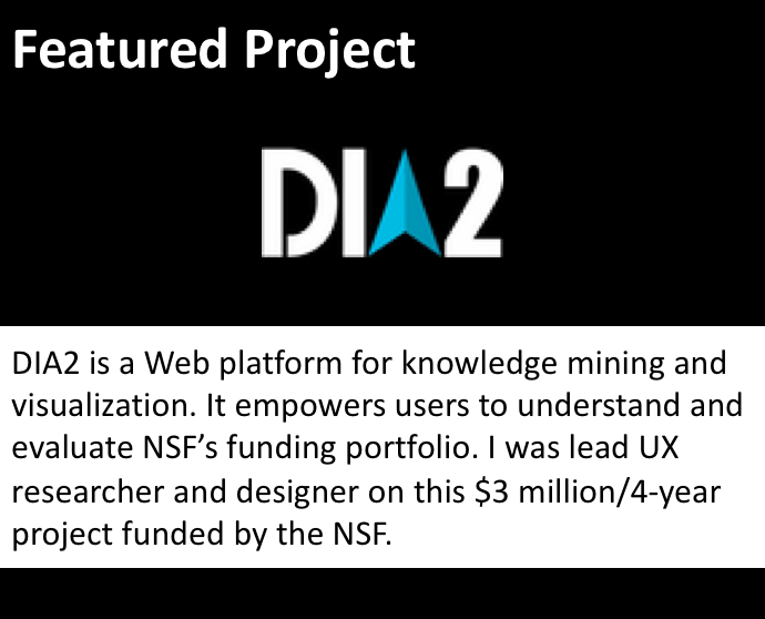
Problem: The National Science Foundation (NSF) needed a way to help them understand and evaluate their funding portfolio.

Context: NSF is a federal agency that provides, on a peer-reviewed, competitive basis, funding for research, in order to advance the mission of science.

My role: I was a co-Principal Investigator on this $3 million, 4-year project. I lead the UX research and design.

Project goals: 

  1. Create a tool for monitoring and evaluating the NSF funding portfolio that would serve NSF’s internal and external users.
  2. Advance the mission of science by generating fundamental knowledge and research publications in the area of portfolio management.

Phase 1: NSF employees

In the first phase of the project, we focused on serving the internal NSF audience. My contribution to the project was as follows:

I planned & conducted formative research in the field in order to identify user groups inside the NSF and understand their needs. I focused the data collection around questions such as:

  • What are decisions made by NSF employees on a regular basis?
  • What information do they need to make those decisions? Where is that information located, in what formats, and how do they access that information?
  • What are the larger goals of NSF employees? What makes them feel successful? What are their big motivators?
  • I closely supervised a graduate research assistant who assembled the user modeling report containing 3 personas. We published a paper in the Proceedings of HCI International that presents the results to an academic audience.

I chose the most vulnerable persona as the primary one. I lead the interdisciplinary research team through a design exercise where we created a context scenario for our primary persona and extracted design requirements – what information would Matt need in order to begin understanding his funding portfolio and be productive at his new job? I generated early sketches based on our brainstorming. The general approach we took to knowledge mining and visualization is explained here and here.

I directed students as they started working on wireframes based on my sketches and coordinated the communication between the UX and technical teams. In the days before Slack, I used an internal team blog to track and communicate work.

I conducted early testing on the alpha version. My goal was to assess ease of learning. Could our users figure out how to use our Web application? Would they understand the interactive data visualizations and interpret them correctly? User feedback, documented in this report, included comments such as:

I feel this was designed for me!

and

This thing reads my mind!

We delivered DIA2 to the NSF and proceeded to focus on the external audience:

Phase 2: NSF external audience

The team identified STEM faculty members as the largest external audience. These are researchers who need to understand the funding portfolio in order to better target their proposals to the NSF.

I designed an interview protocol for intercept interviews we conducted at the annual meeting of the Association for Engineering Education, where we were most likely to encounter STEM researchers from various fields. I trained a number of graduate students and we all conducted interviews and collected the data we needed in 3 days.

I lead a cross-disciplinary team of graduate students from both the UX and technical teams through a 2-day affinity diagramming process, which resulted in one persona, documented in this report and this conference paper.

With an understanding of the second user group’s needs, I wanted to ensure DIA2 served them well. I lead the team through cognitive walkthrough exercises where we asked whether Dr. Anderson, our persona, would know what to do, and if he performed an action, whether he would know he was making progress towards his goals. I supervised one of my graduate students as she conducted usability testing with this new user group. This work resulted in a conference paper and her M.S. thesis.

DIA2 served about 2 million visitors in a 2 year period. About 2,000 users had created accounts. The project is over and the data is no longer updated, as is common with a lot of academic projects.

The research & design process, as well as technical aspects of DIA2 are presented in a paper we published in IEEE Transactions on Visualization and Computer Graphics. More research related to DIA2 is indexed on the project’s research page.

Which self?

I recently watched this TED talk by Daniel Kahneman about the experiencing self and the remembering self.

Apparently, they’re quite different. The experiencing self is the one who lives and feels in the moment. The remembering self is the one that engages in retrospective sense-making and decides, post-facto, whether the experience was good, fun, etc. It is the remembering self’s evaluation that informs future decision making.

This has enormous implications for UX evaluation. Even if the experiencing self has a (relatively) bad time, as Kahneman explains in the talk, but the remembering self makes a positive evaluation, the experience is remembered as good. We can measure UX in the moment, and track eye gaze and all that jazz. But ultimately, what really matters for future decisions is what users take away from the experience and how they evaluate it after it’s over. This is good news. It means that users may forget or put up with a few frustrations – and still assess the experience well, especially if it ends well. It also means that the research framework for website experience analysis that I created back in 2004 is valuable, because it focuses on how users make sense of the experience and what they take away.

Active learning ideas for CGT 512

I am fully behind the theory of active learning, but I struggle with putting it in practice. It takes a lot of creativity to engineer situations that stimulate active learning, and I am not entirely trained – I don’t know the toolbox. But I try.

I’m pretty proud of what we did in my HCI graduate course tonight, and I don’t want to forget it, so here we go:

Discussion on GUI history ended with question about where future interface paradigms are headed. We experimented with tangible computing. I gave each group some items (toys, boxes, trinkets)  to use as starting points for designing a communication system that uses those items for interaction.

The students had read 4 articles on various types and aspects of HCI design (UCD, participatory/value sensitive, critical, and a comparison article). We started by ranking the reading is terms of: ease of understanding and favorites. This gave me a feel for what reading(s) were harder to understand. I asked question to tease out the essence of each article and then each team got post-its of 2 different colors. On one color they had to list activities the authors undertook as part of the design process, and on the other, concepts that were new to them. One item per post-it.

I then asked 2 groups to combine their activities on one board and  their concepts on another, and then organize them into categories and name each category. We heard brief presentations of the categories on each board, and I interjected points meant to link everything together.

Ended class with some questions meant to integrate the material and 2 minutes of reflection for students to note down their take-aways.

Website Experience Analysis

This post explains an alternative research protocol, website experience analysis (WEA).

Website experience analysis is a research protocol (set of procedures) that can help researchers identify what specific interface elements users associate with particular interpretations.

WEA focuses on the messages that users take-away from their experience with the interface.

All interfaces try to communicate something, such as:

  • you should trust this application with your credit card data
  • you should come study for a MS degree in CGT at Purdue
  • etc.

WEA allows you to find out:

  1. whether the interface actually communicates this message – do people actually take away the message that you intended, and to what extent?
  2. what specific elements of the interface users associate with those particular messages (trust, CGT is a good program, etc.)

The WEA questionnaire is based on prominence-interpretation theory. It works with pairs of items that ask:

  1. Ratings of user perceptions (e.g. trust – on a scale of 1-10)
  2. Open-ended: what about the interface makes the user feel this way?

WEA is based on a much more complex theoretical framework of the website experience. The framework breaks the website experience down into two major dimensions: time and space. WEA then explains the phases of the experience as they unfold across time, and the elements of the website space (elements are categorized according to element functions). The theoretical framework is likely only valid for websites, because the experience with another type of interface, even though it may have the same three main temporal phases (first impression, engagement, exit) will likely differ in terms of the steps within those phases and the nature of the spatial elements and their functions.

WEA is different from a regular questionnaire because it connects perceptions with specific interface elements. Questionnaires will tell you whether the user trusts the product, but they won’t provide specific feedback as to what particular elements may account for that perception.

WEA is modular, which means that a different battery of items can be used, depending on the focus of the research. I used WEA in 2 contexts:

  1. To evaluate the experience of visiting organizational websites. Here, I used the 5 dimensions of good relationships between organizations and their publics: trust, commitment, investment, dialog, etc.
  2. To evaluate whether emergency preparedness websites persuade users to take emergency preparedness actions. Here I used a battery of items derived from a theory of fear appeals (EPPM) and assessed whether users perceived there is a threat, believe they can do something about it, believe the recommended actions would be effective, etc.

I think WEA would provide excellent feedback about how prospective students perceive the CGT department, based on their experience with the website. It would be very valuable to find out exactly what about the website makes them feel that:

  • they would benefit from a CGT MS
  • they would fit in
  • they would have a good educational experience
  • etc. – we have to determine the relevant set of items. Ideally, we would have a theory to guide item development.

WEA can be used with other research questions, such as: How do HR managers look at job candidates’ online information? (hello, Jack!)

WEA can be improved upon to better tap into emotional aspects of the user experience. It can be modified to be a more inductive approach, that elicits emotions and interpretations from users rather than asking about specific interpretations (such as trust, etc.)  – thank you, Emma, for these suggestions!

If you would like to read more about WEA, you can find the relevant citations in Google Scholar. I can provide copies of the papers if you don’t have access to them.

Comments on Mac OS X Lion

The actual title of this post is “A couple of things I hate about OS X Lion.”

So, what’s the big improvement in Mac OS X Lion? What does it enable users to do that they couldn’t do before?

In terms of interface, it seems to be a political, not user-oriented movement. The interface decisions say to me: “we’re moving laptops towards touch-screen interfaces.” It may be a strategic step in the next direction for the company. But does it work for the user?

The biggest, and, pardon my French, stupidest mistake/bad idea in Lion is “natural scrolling.” By “natural scrolling” they mean reversing the scroll direction, so now you scroll up if you want to go down a page. Why is this stupid? Let me count the ways:

  1. It takes a behavior that is so ingrained, for some people, since birth – for others, since they started using mice in the early ’70s – a behavior that’s more than second nature, it is automated and memorized by the body and it attempts to reverse it. Good luck with that. After trying natural scrolling for a bit, I got so confused, I don’t know which way is up or down. Good thing you can turn it off.
  2. It takes a behavior that is indeed natural in a touch-screen device when you interact directly with the content, not with the scroll bar and imports it to another, very different device. Just because this behavior is natural on the iPad, where you are touching the page, not the scrollbar, it does not make it so on the computer interface – where design conventions are different, and scroll bars still exist, even if Safari won’t display them.
  3. It forgets that people interact with computers via mice, not only track pads. Don’t get me wrong, I love the track pad. I love the feel of it and the way it works. It’s just that after using it for 6 months without a mouse, my hand hurts so badly, sometimes I think I broke a bone (or more). So I can’t use the track pad, because it literally hurts my hand. I use a mouse. Where scrolling behavior is so automatic (see #1) that all of us are too old to learn a new trick. And where scrolling up is a much more difficult, inconvenient, painful gesture than scrolling down. So, when using a mouse, this natural scrolling is bad, bad, bad for the 3 reasons named before.

Good news: you can turn it off. System Preferences > Trackpad > Scroll & Zoom

What else does Lion do, besides trying to persuade me my MacBook Pro is an iPad?

The Mail interface is much better now, and I can begin to tolerate it – because it looks more like Outlook, which is the only Microsoft product I like. BUT.

They added these silly, annoying animations that are a complete waste of time and, after you’ve seen them once, become a plague. When replying to an email, upon hitting the reply button, the email message I’m replying to does this little dance. It hops out of its place, floats to the top right of the screen, then it settles down in front of me and only then can I begin to type. Cute, the first time. Completely unecessary annoying waste of time after that. Life’s too short to watch email messages dancing on the screen a hundred times a day. I swear I saw Safari dancing around a bit (or some unnecessary animation) when I started it. I haven’t figured out if or how to turn these off.

iCal is pretty much the same. They moved some buttons around, hopefully based on usability studies. No problem there. But they made it look cheesy. The top bar looks like leather (really?!) and it has little marks where you see you “tore off” the previous page. Really?! Talk about adding unnecessary cutesy stuff. And cutesy is a matter of taste. So if you add it, you must allow people to customize it. But I haven’t figured out a way to do it, and am not sure it is possible. If it is, I shouldn’t have to spend 20 minutes trying to find it. Right click, baby. Can we still do that? Oh, wait, two finger tap. Why is that wrong about iCal?

  1. Things that pretend to be what they’re not are tacky. That is not leather. I don’t want it to look like leather. In fact, I don’t really want it to get my attention.
  2. Many people hate leather.
  3. Many people hate that ugly color they chose for the “leather”
  4. The paper calendar metaphor hurts computer-based calendars by imposing on them paper-based page limitations. Cooper wrote about that a long time ago (see pp 37-38). I wonder why nobody listens?

I’m also experiencing some erratic behaviors, like random windows being brought to the front when I select an email address in the To field in Mail… but I assume those were not intended as a way to add excitement to users’ lives.

Tell me, what do you love/hate about Lion?